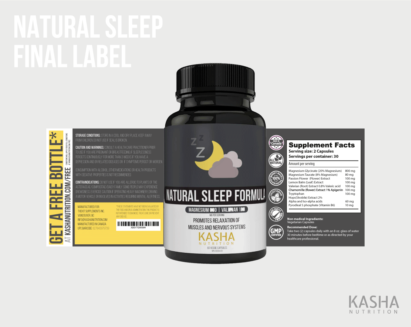
Kasha Nutrition
Branding / Art Direction / Marketing / Print / Packaging / UI/UX / Web Design | 2017-Present
KASHA Nutrition is an Amazon-based supplement start-up that focuses on delivering on-the-go health via eCommerce channels. While working closely with the co-founders, I had the opportunity to craft their branding identity, packaging and a web design + strategy for their new online shop.

THE KASHA FORMULA

Website
As a new, upcoming nutrition company gaining more and more traction on the web, KASHA saw the need to revamp their current eCommerce site to better fit the usability and needs of their target consumers (millennials). The problem with achieving that goal was the complex and hard to understand template. This new redesign focuses on transferring health knowledge to their target audience, subsequently increasing traffic and impressions.
Goal:
-
A simplistic, yet informative user interface for millennials to get their information easily
-
Create a lifestyle brand through this new design
Research Insights:
In order to design effectively for KASHA's new website, I investigated current millennial consumption trends to provide key insights that will guide my work.
Key Insights:
-
Educate: Target audience prefers a transparent, honest and simple learning platform for customers to learn/discover their own health goals
-
Awareness: Earn customer's trust through social media and peer word of mouth
-
Customization: Trending preference towards being able to tailor supplements to each individual
-
Ease: Simple and straightforward guide that will allow easy integration to current lifestyle
.png)
User Research:
I opted to conduct a series of interviews targeted at millennials aged 20-25 years of age. This was done in order to further understand how customers make buying decisions, their desires/wants as well as their obstacles that deter them. These interviews were done via video chat and 15 participants were given a set of the same open-ended questions.

80% of participants found it difficult to find the information they were looking for
-
Most individuals are willing to do research, but still found obstacles in attaining the correct research
-
Some participants hypothesised it was due to focus on certain products (i.e. some bestseller products like collagen had more material rather than smaller supplement types)
Majority of participants desired further clarity
-
I.e. how to take supplements, understanding where the ingredients are sourced from and the raw materials that goes into manufacturing health products
62% of interviewees would willingly align themselves to brands
-
In particular, brands that advocate for their consumer base and stray away from being a "faceless and nameless" brand
-
Customer engagement was a key goal for participants.
Brand Persona #1 - New Health Convert:

Brand Persona #2 - Nutrition Advocate:

User Experience:


User Experience Solution:

High Fidelity Prototypes:
.png)

.png)
.png)
Usability Testing on Prototypes:
Usability testing was conducted with 5 individuals that I believe best fit our personas (3 were "New Health Converts" while the other 2 "Nutrition Advocates" - the former had a higher percentage as this persona was more prevalent in initial user research). These individuals were recruited on an online forum and the test was executed on a Zoom call. This allowed me to observe their actions through sharing screens and note down key insights.
The main goal of this test was to discover the best user flow to purchase their desired supplements.
Key Insights:
😀 Most participants preferred a feature banner that spanned the entire screen width as it was less overwhelming
😀 Rather than having an option to customise a supplement regimen, users opted for a CTA that would directly lead to a specific lifestyle as it would save time.
😀 Test takers greatly appreciated seeing the "Bestsellers" section on the homepage, as they were able to quickly see what the brand is known for.
🙁 Most participants did not like animations/motion graphics as it slowed down loading time
😀 More information on product pages (e.g. ingredients, benefits, how to use) was valued
🙁 Users were confused to scroll on homepage concept 4
Winning Outcomes:

Branding


I first presented 3 preliminary concepts to the client to determine if art direction was the right path. Showcased below are 3 initial ideas:


After KASHA selected Concept 3 as the final direction, I worked with my client to further evolve the brand across different marketing collateral.
Iconography:

Color System: